Rethinking “One Store For All Your Games”
A high-stakes bet on unifying game storefronts inside a single launcher and the mental model that quietly worked against it.
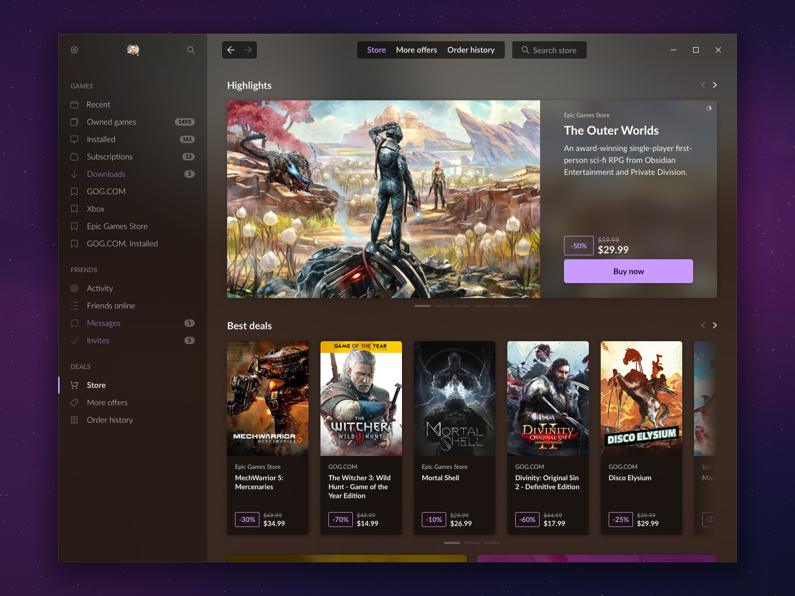
The GOG GALAXY STORE front page
A single storefront surfacing offers from multiple platforms, each clearly tagged by source (GOG.COM, Epic Games Store).
Project Overview
GOG GALAXY set out to solve a real, widely felt problem for PC gamers: needing a separate launcher for every storefront (Steam, Epic, Origin, Uplay, and a growing list of publisher-specific apps like Bethesda’s and Rockstar’s). GALAXY’s promise was simple: all your games, in one place, regardless of where you bought them.
GOG GALAXY STORE was the next step in that mission: instead of just unifying your library, let people buy games from other storefronts without ever leaving GALAXY: all your game stores, in one place. I designed the store experience end-to-end and led the research that shaped it, as the sole designer on a small cross-functional team.
Context and My Role
I worked on this as a Senior UI/UX Designer, as the only designer dedicated to the project. The team consisted of one Product Manager, a frontend and backend engineering team, and one QA tester — there was no dedicated Head of Product; the initiative sat under an IT director. Day-to-day design decisions were mine to make, in close alignment with the PM, and within a broader direction set by the team that owned the core GALAXY launcher (at the time led by a Managing Director with a strong design background who had personally designed much of GALAXY’s foundation).
This was also a company-level bet: bringing external, competing storefronts into a first-party launcher was commercially and politically sensitive, and the project operated under real-time pressure to ship within a fixed scope and timeline.
The Problem
GALAXY’s original design made a deliberate choice: hard-separate the library from the store. At the time, that separation was a feature, not an oversight. Many gamers were frustrated by “launcher fatigue” (installing yet another dedicated app just to play one publisher’s games), and GALAXY was pitched to that exact audience: people who wanted a single clean launcher, not another storefront being pushed on them. Keeping the store out of sight of library-only users was a way of not alienating them.
When we built GOG GALAXY STORE on top of this foundation, that same wall became a liability. Because of the time pressure to deliver, early usability testing happened on a live, early working version of the store rather than on wireframes or prototypes, so problems surfaced later than I’d have liked, but they surfaced clearly:
Discoverability failure.
In multiple rounds of research, participants struggled to even find their way into the store area. It was a direct consequence of the wall we’d inherited by design.
In multiple rounds of research, participants struggled to even find their way into the store area. It was a direct consequence of the wall we’d inherited by design.
A significant mental-model mismatch.
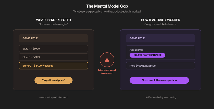
Users consistently expected the store to behave like a price comparison engine: “show me this game, tell me where it’s cheapest.” In reality, the model was the opposite: each game was tied to a specific source platform (GOG’s own catalogue or, at the time, a curated selection from Epic Games Store), clearly labelled by origin, with no cross-platform price shopping involved. This wasn’t a labelling problem so much as an expectation problem, and it mattered more than it might sound, because it directly shaped how much value people thought the product offered them.
Users consistently expected the store to behave like a price comparison engine: “show me this game, tell me where it’s cheapest.” In reality, the model was the opposite: each game was tied to a specific source platform (GOG’s own catalogue or, at the time, a curated selection from Epic Games Store), clearly labelled by origin, with no cross-platform price shopping involved. This wasn’t a labelling problem so much as an expectation problem, and it mattered more than it might sound, because it directly shaped how much value people thought the product offered them.
Research and Design Response
I ran the research in stages appropriate to a fast-moving beta: two rounds with external users (task-based sessions plus follow-up interviews) and two to three internal rounds (task-based testing, open exploration, and feedback workshops with staff as proxies).
The discoverability and mental-model findings led to two connected design responses:
1. Breaking down the wall.
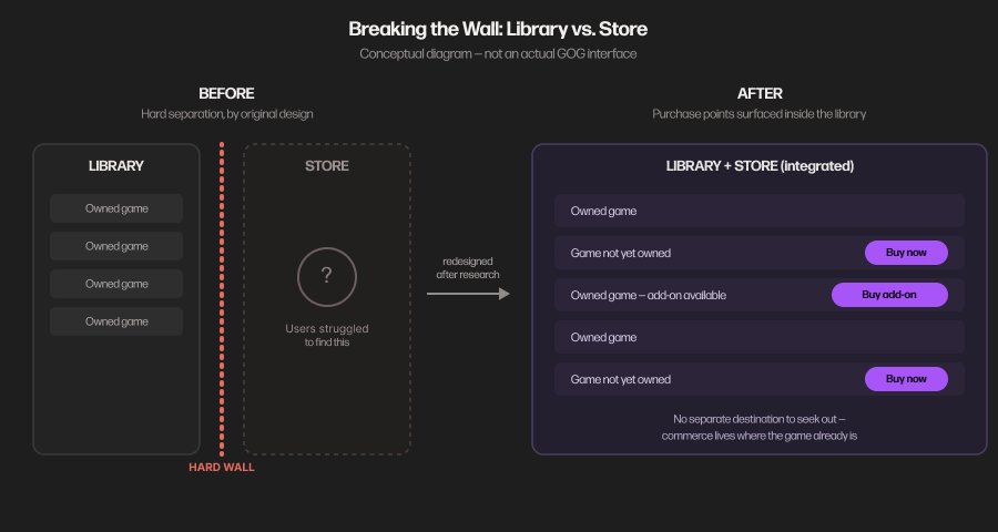
Rather than treating the store as a separate destination users had to actively seek out, we started dissolving the hard boundary between library and store: surfacing purchase options directly inside the library view, for games you didn’t yet own, or for add-ons to games you already had, instead of confining every commercial touchpoint to a separate store tab. This was a meaningful shift from GALAXY’s original founding principle, made on the strength of what we were seeing in research rather than as a plan from day one.
Rather than treating the store as a separate destination users had to actively seek out, we started dissolving the hard boundary between library and store: surfacing purchase options directly inside the library view, for games you didn’t yet own, or for add-ons to games you already had, instead of confining every commercial touchpoint to a separate store tab. This was a meaningful shift from GALAXY’s original founding principle, made on the strength of what we were seeing in research rather than as a plan from day one.
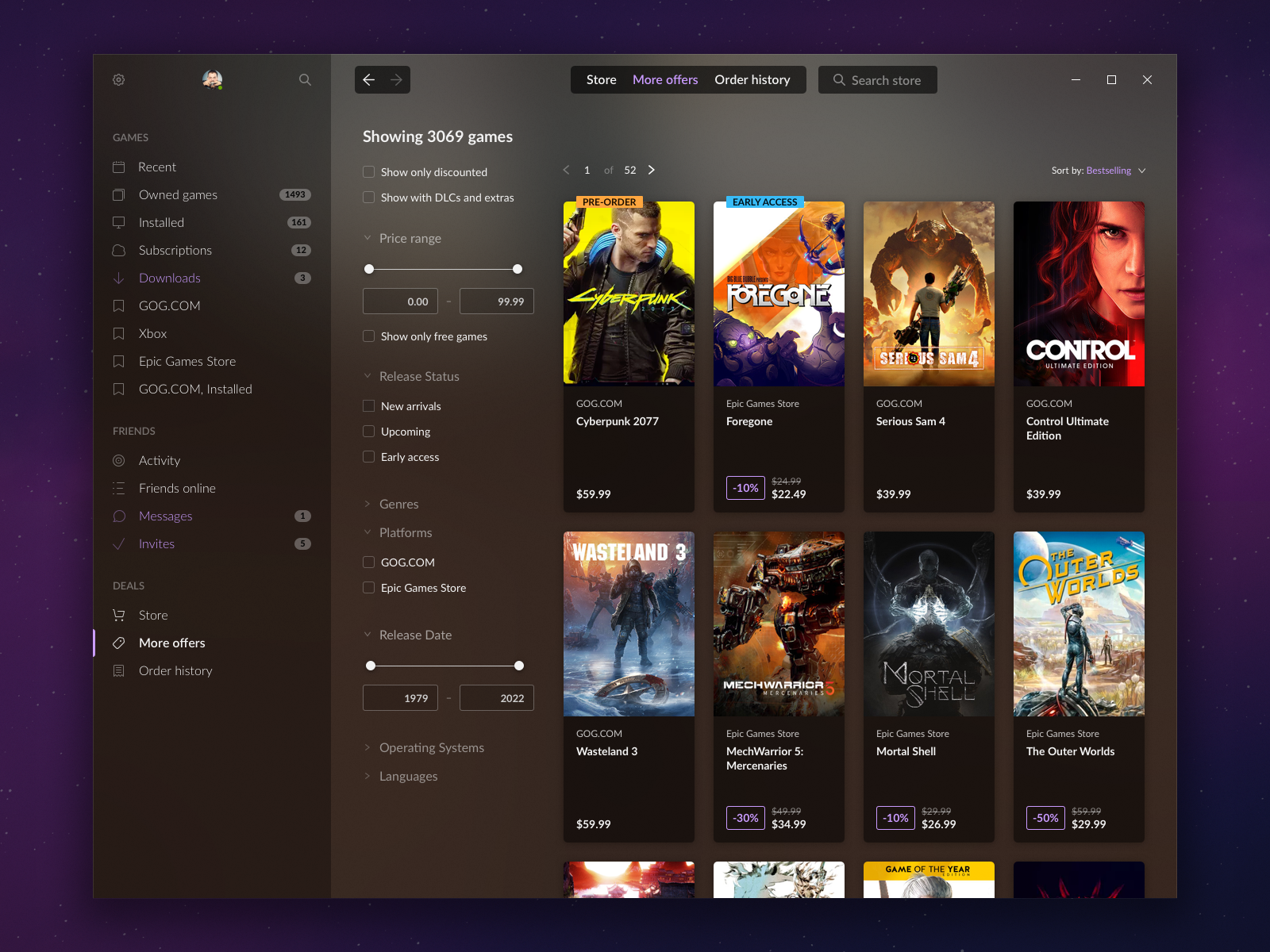
The full catalogue - over 3 000 titles spanning GOG and Epic Games Store - is browsable and filterable by source platform, so players could deliberately choose where a purchase would come from.
2. Correcting the mental model at the point of confusion.
For the price-comparison misconception, the fix wasn’t just “label things better,” though clearer source-of-origin labelling on game cards was part of it. It also meant introducing onboarding communication inside the store itself, explaining what the product actually was and wasn’t, at the moment people were most likely to be confused. Beyond the interface, this same insight informed how the product was communicated outside the platform, informing the messaging used by other teams so the “comparison engine” framing wasn’t reinforced before people even opened the app.
For the price-comparison misconception, the fix wasn’t just “label things better,” though clearer source-of-origin labelling on game cards was part of it. It also meant introducing onboarding communication inside the store itself, explaining what the product actually was and wasn’t, at the moment people were most likely to be confused. Beyond the interface, this same insight informed how the product was communicated outside the platform, informing the messaging used by other teams so the “comparison engine” framing wasn’t reinforced before people even opened the app.
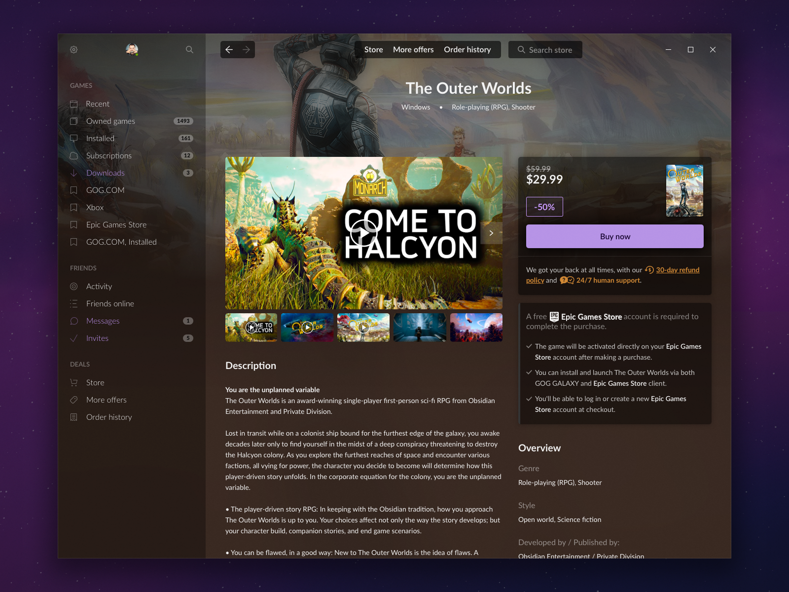
On pages for partner-sourced titles, account and activation requirements were spelt out before checkout, directly addressing the 'where will this actually come from' confusion we saw in research.
Business Outcome and Closure
GOG GALAXY STORE launched with GOG’s own catalogue plus a curated selection of Epic Games Store titles (notable because Epic carried a fairly unpopular reputation among PC gamers at the time), which made this partnership itself a bet on the leadership’s part. Internally, there was an expectation that other major partners would sign on shortly after.
Roughly a year after launch, the project was shut down. I wasn’t part of the conversations that led to that decision. It was made at the leadership level, but the lack of additional storefront partners, against the cost of running the initiative, was clearly a major factor. From a delivery standpoint, the project itself was a success: we shipped the agreed scope, on time, to the standard we’d set for it. Its closure was a strategic and commercial call, not a failure of execution.
No specific performance metrics were shared with the design team at any point during the project, as we weren’t given target numbers to hit, and I don’t have retrospective data to cite here.
Key Learnings
A structural decision can outlive the reason it was made.
The library/store wall solved a real problem when GALAXY launched. Once the product’s ambitions changed, that same wall actively worked against the new goal, and it took direct evidence from users, not intuition, to justify unwinding a founding design principle.
The library/store wall solved a real problem when GALAXY launched. Once the product’s ambitions changed, that same wall actively worked against the new goal, and it took direct evidence from users, not intuition, to justify unwinding a founding design principle.
Mislabelling isn’t always the real issue. The misaligned expectations are.
Users didn’t misunderstand a badge or a button; they arrived with an entirely different, and reasonable, model of what the product should do. Fixing that required communication at the right moment in the experience, not just clearer copy.
Users didn’t misunderstand a badge or a button; they arrived with an entirely different, and reasonable, model of what the product should do. Fixing that required communication at the right moment in the experience, not just clearer copy.
Good execution and project survival are two different things.
We delivered exactly what was asked within the given timeline. The project still ended, for commercial reasons entirely outside design’s control. Being able to separate “did we do this well” from “did this succeed as a business” is part of operating at this level.
We delivered exactly what was asked within the given timeline. The project still ended, for commercial reasons entirely outside design’s control. Being able to separate “did we do this well” from “did this succeed as a business” is part of operating at this level.