A developer's working prototype solved the technical problem.
It still needed real UX before it could actually replace the manual process it was meant to fix.
It still needed real UX before it could actually replace the manual process it was meant to fix.
Project Overview
ART (Asset Rendering Tool) lets GOG's partners create the marketing visuals required for a game release (key art, logos, promotional banners) themselves, directly in the browser, instead of going back and forth with GOG's internal graphics team until every asset was approved. I designed the interface and interaction model, working from an engineer's early proof of concept through to a shipped, self-service tool.
Context and My Role
I was the sole designer on this project, working primarily alongside frontend engineering to bring it to life. ART started as a bottom-up initiative. A developer had already built a working proof of concept demonstrating that the core mechanic (cropping, positioning, exporting) was technically solvable. What it didn't have yet was real UX thinking behind it: it solved the technical problem, not the actual workflow problem for the people who'd use it.
The project also aligned with a broader shift in product strategy at the time: moving away from bespoke, white-glove handling of every partner request toward self-service tooling wherever it made sense.
The Problem
Before ART, every marketing asset needed for a game's release (from key art crops to logo placement) was handled by GOG's small internal graphics team by hand. That team didn't just handle game assets; they were also responsible for the company's other creative output, like promotional key visuals and marketing materials. Every hour spent manually cropping and positioning a partner's assets was an hour not spent on that other work.
The problem also looked different depending on who you were dealing with. Larger publishers usually came with strict, well-defined brand guidelines that had to be followed precisely, a different kind of manual diligence. Smaller and indie publishers, on the other hand, often supplied source material that was lower-quality or poorly composed to begin with, requiring real hands-on intervention to turn it into something presentable. Either way, the bottleneck was the same: a small internal team, manually processing every asset, for every release.
Design Approach
Starting from the engineer's proof of concept, I designed around two very different groups of users who'd actually touch this tool:
- The internal team itself, several of whom didn't have access to Photoshop outside the dedicated graphics team — meaning even simple internal asset requests had previously been routed through the same bottleneck this tool was meant to relieve.
- Partners of wildly varying design sophistication, from publishers with strict, professional guidelines to smaller studios with rough, unpolished source material.
That spread shaped the core design decisions: predefined templates matched to GOG's actual platform requirements, so nobody had to guess at correct dimensions or layout.
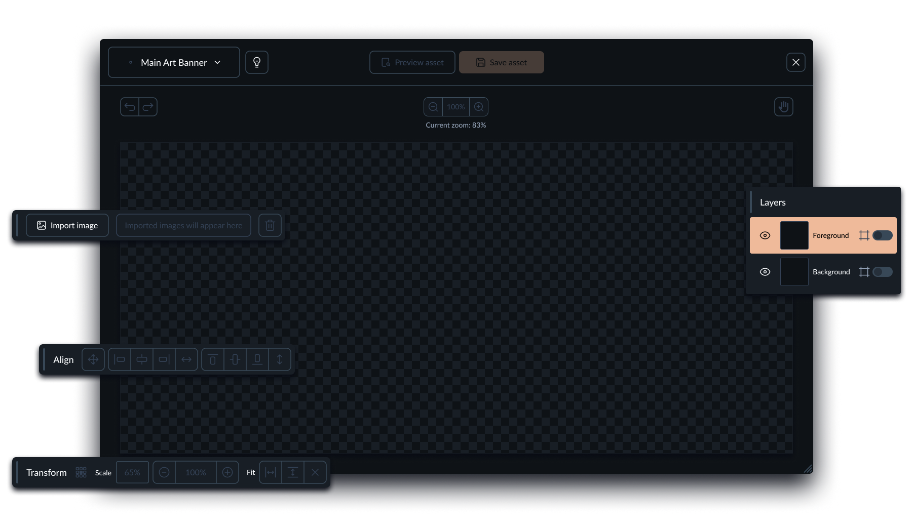
ART's main window in its initial state
Layer management with cropping, positioning, and scaling controls gave more demanding, brand-guideline-driven partners the precision they needed to combine a logo and key art into a finished asset.
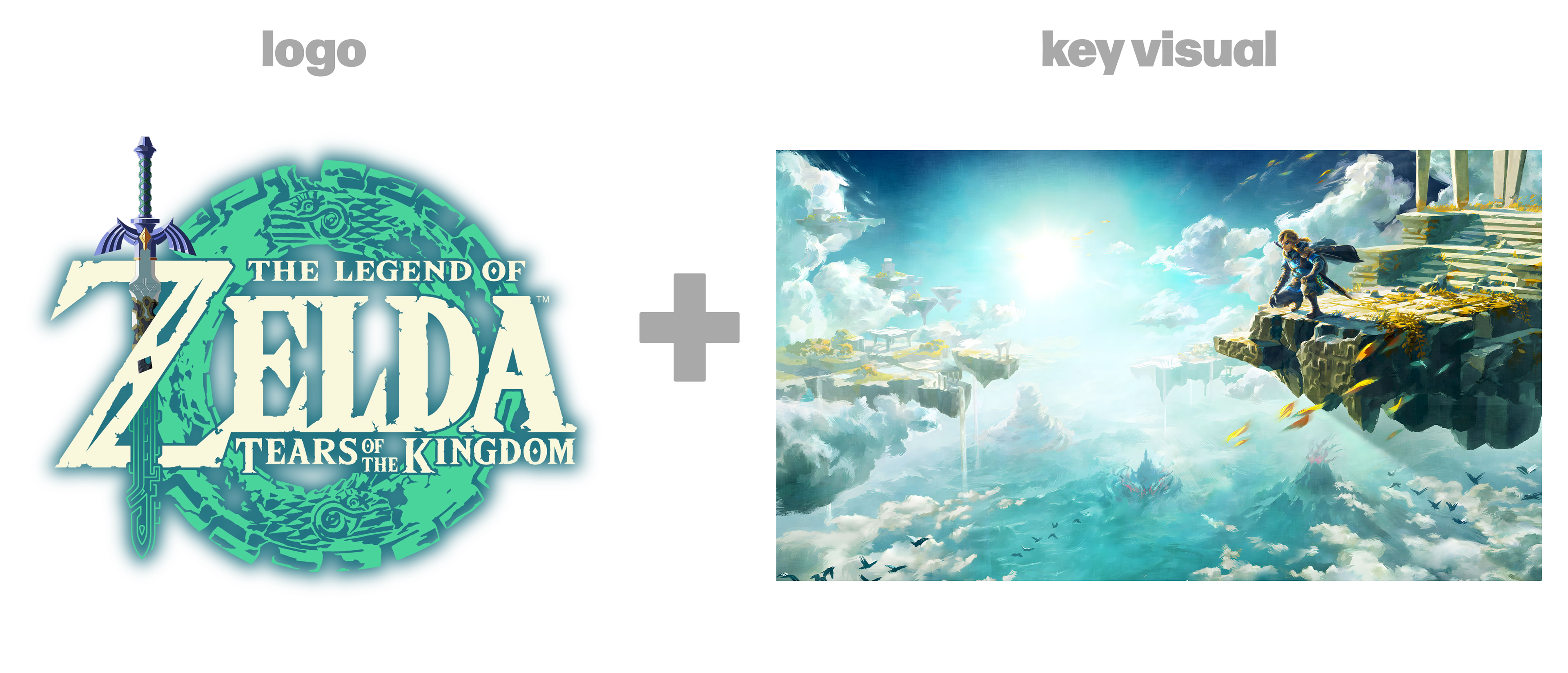
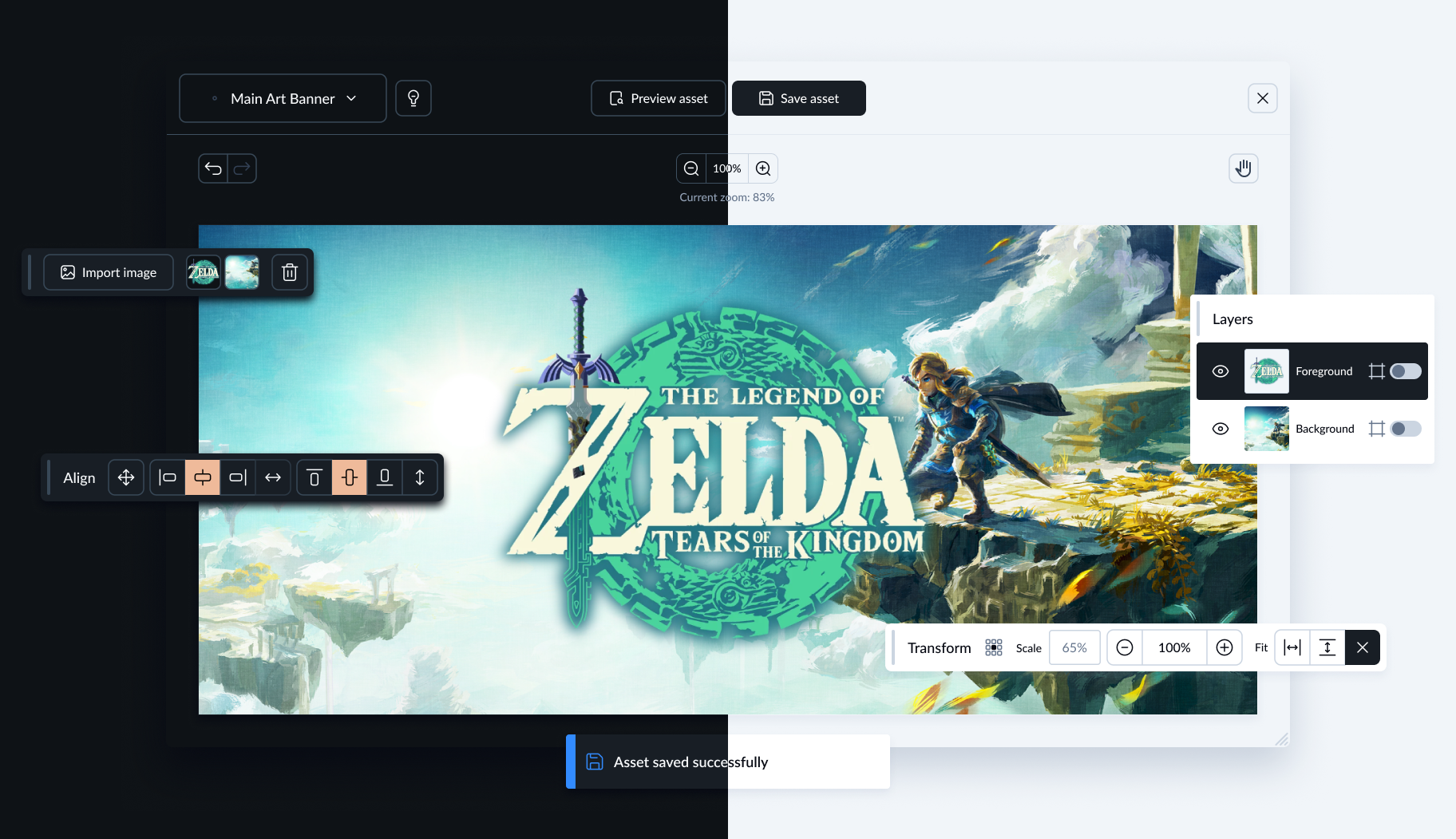
A safe-zone preview flags when essential elements like a logo would get clipped on export, protecting less experienced users from shipping a broken asset without realising it.
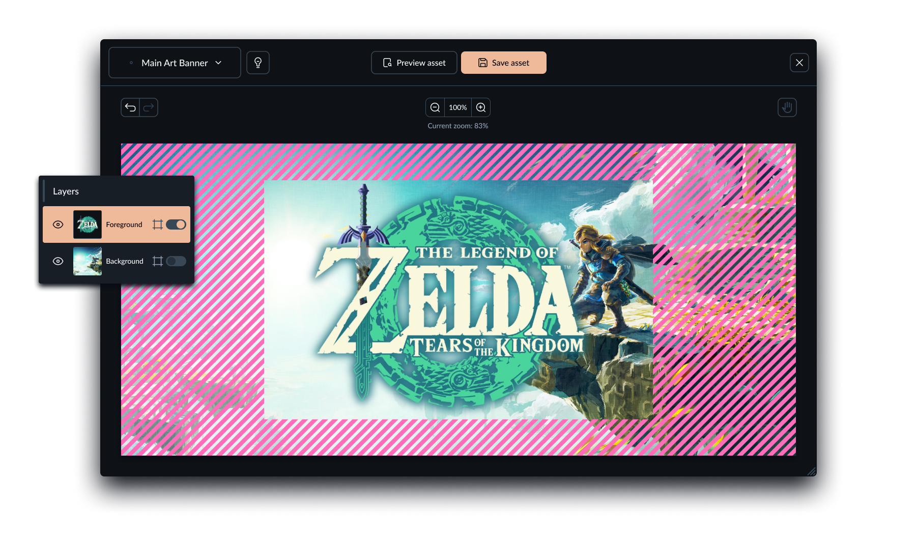
Asset with safe-zone preview enabled for the foreground layer. The logo is perfectly positioned and will not be cropped.
The tool went out first to a narrow group of users, and I iterated based on what came back, improving how mandatory materials were flagged and adjusting the positioning tool's behaviour to match what users actually expected.
Outcome
No usage metrics were shared for this project, the same as with other internal tools I've worked on at GOG. What I can say directly: ART was well received by both audiences it was built for. It meaningfully reduced the load on the internal graphics team, freeing them from a recurring stream of manual asset requests that had been competing with their broader creative workload.
Key Learnings
- "Self-service" isn't one interface. It's at least two. Designing for a brand-compliance-driven publisher and a first-time indie developer with rough source assets meant building guardrails (templates, safe zones) that protect the less experienced user, without getting in the way of the more demanding one.
- A working prototype and a usable product solve different problems. The technical proof of concept already worked before I got involved: it could crop and export an image. What it couldn't do yet was guide someone who didn't already know exactly what they were doing, which is where most of the actual design work happened.
- Internal friction is still friction. The team without access to Photoshop wasn't an edge case. They were proof that the same manual bottleneck this tool solved for external partners was quietly costing the company internally too.
Disclaimers:
The absence of information regarding metrics is due to the company's policy of not disclosing sensitive data.
The user interfaces and design elements showcased in this portfolio are my original work. The content, such as images, logos, and trademarks, belongs to their respective owners. These materials are used solely for the purpose of demonstrating my design capabilities and are not intended for commercial use or to imply any affiliation with or endorsement by the respective companies.