Project Overview
Navigation breadcrumbs for a sports betting app – helping users switch matches faster.
For this project, I designed an extended breadcrumb pattern combined with a bottom-sheet drawer for a mobile sports-betting app. The goal was to make it much easier – and faster – for users to move between sports, leagues and matches, especially when betting live, where every second matters.
I led the end-to-end design: from opportunity framing through interaction design and prototyping, to three rounds of user research (two with internal staff as proxies and one with external customers).
Context and my role
This work started as a spin-off from a broader initiative to unify pre-match and live views in the app. During early discovery with the product team, we realised that simply aligning the visuals of those screens would not unlock much value. The deeper pain point was navigation itself.
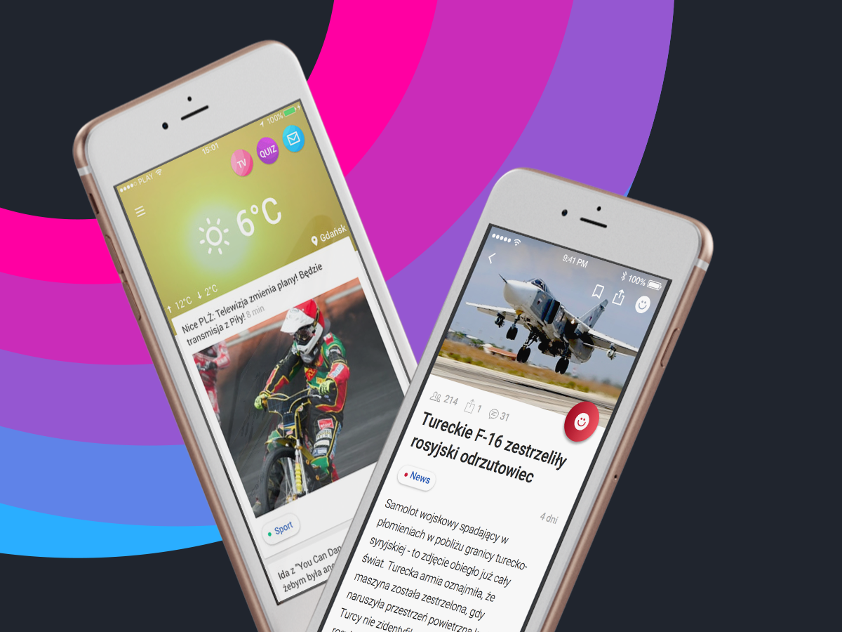
From user feedback and competitive analysis, we already knew that navigation in betting apps is often perceived as confusing and rigid – and that this becomes especially painful in live betting, where finding the right event quickly is critical.
My role:
- Co-defining the opportunity with the Product Manager and Head of Product,
- Designing the navigation model and breadcrumb pattern,
- Creating interactive prototypes in Figma,
- Designing and running three research rounds (2x internal staff, 1x external users),
- Aligning with engineering on feasibility and rollout options
Problem
In the existing app, moving between events was clumsy and slow.
To switch to another match or league, users typically had to:
To switch to another match or league, users typically had to:
- jump back to the “Offer” item in the bottom navigation and re-enter the desired section, or
- rely on back gestures to step through a chain of previous screens.
Both options were fragile under time pressure: back gestures weren’t always precise, and returning via “Offer” meant repeatedly rebuilding the path to the desired event. For live betting, where seconds matter, this made navigation feel heavy and frustrating.
Design approach and solution
Navigation model & pattern
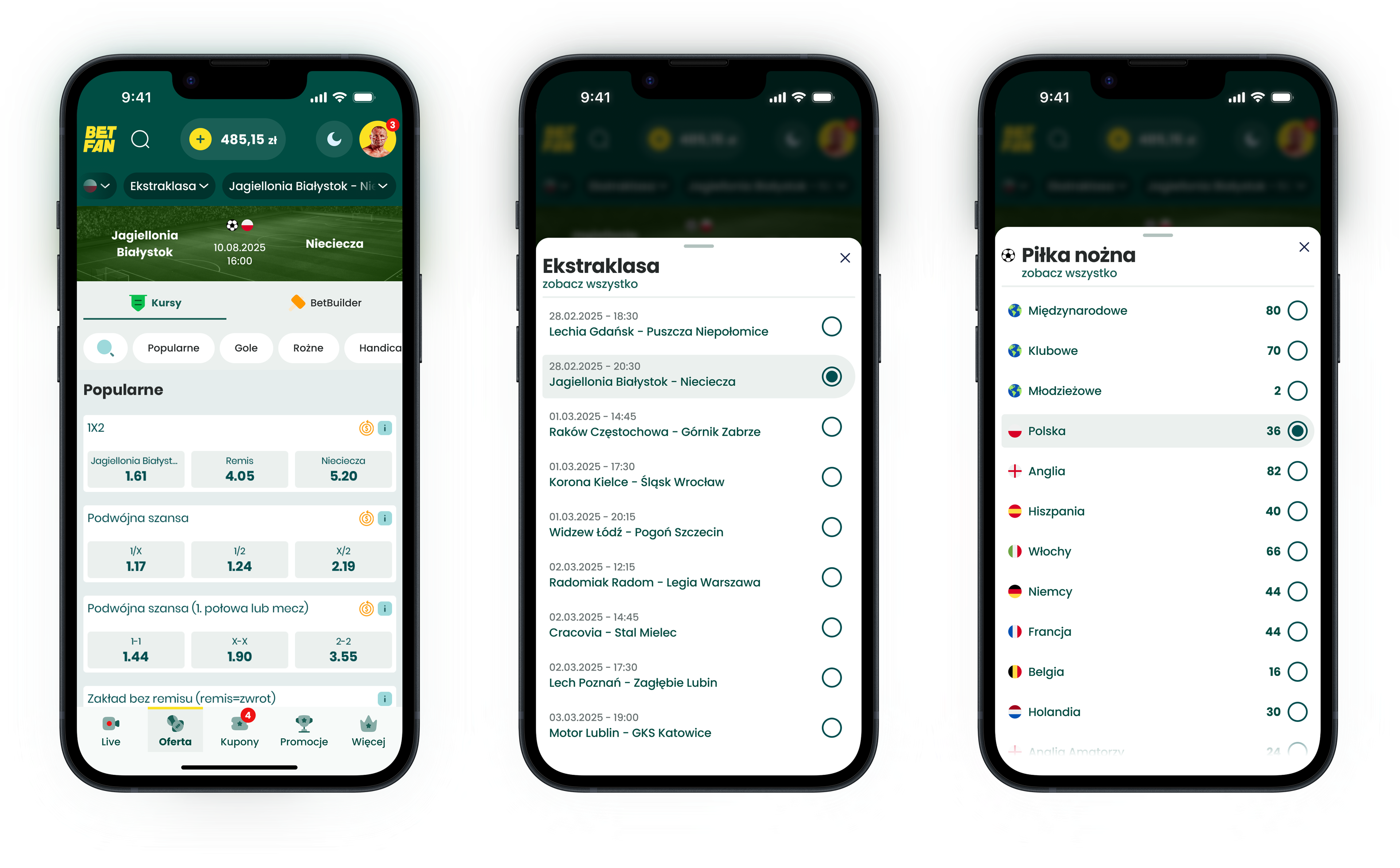
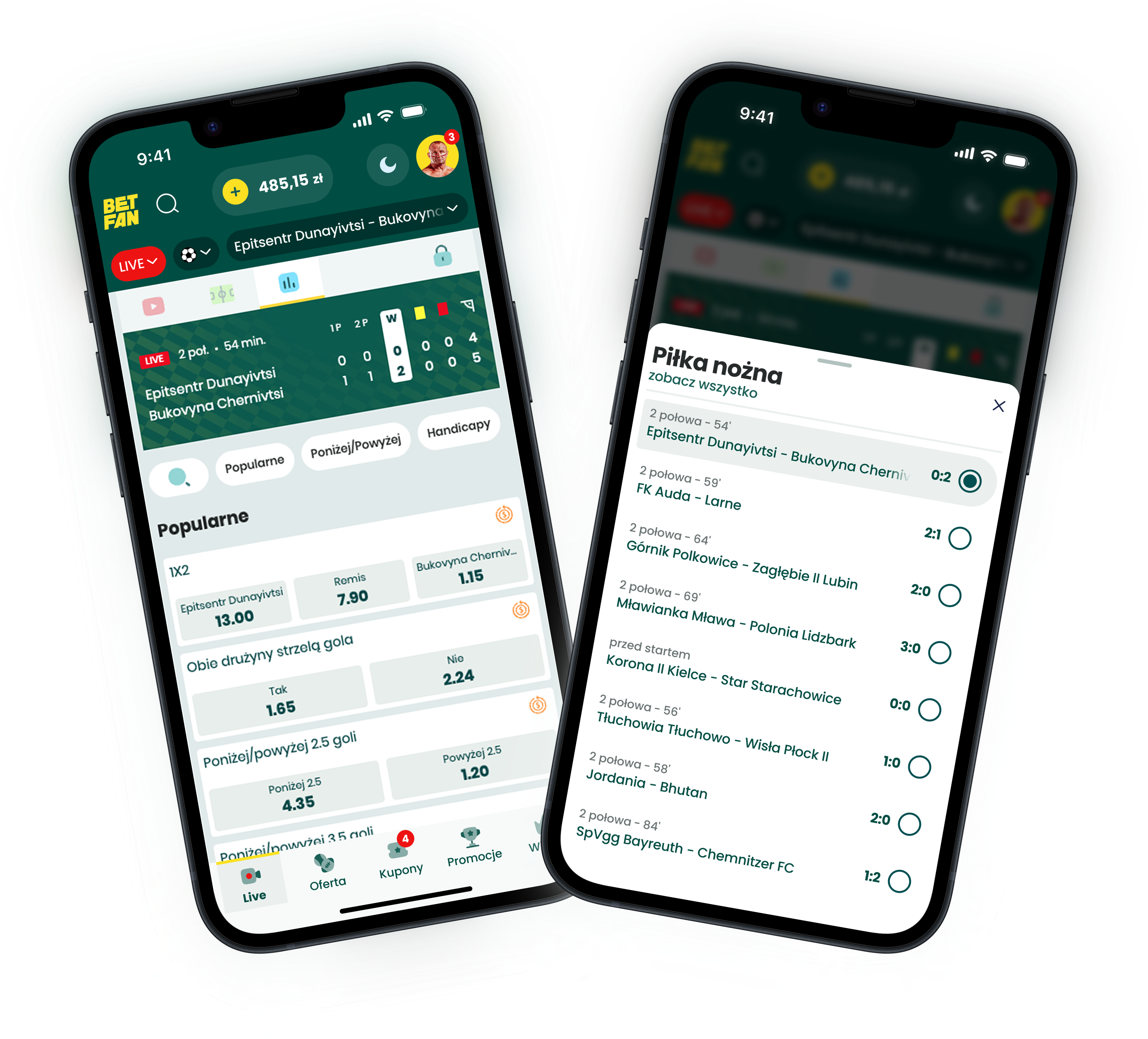
Rather than redesigning isolated screens, I started from the information architecture and defined three core levels that should always be visible and actionable:
1. Sport
2. Competition/league
3. Match/event
On top of that, we introduced a combined breadcrumb + drawer pattern:
- A compact breadcrumb row at the top shows the current path, with the active level emphasised.
- Tapping any breadcrumb opens a bottom-sheet drawer with all other options on that level (e.g. all matches in a league).
- Selecting an item instantly updates the underlying view without leaving the screen.
This gives users a clear sense of where they are and a quick way to switch context, which is especially important for live betting.
Research & iteration
The research had two simple questions:
1. Is the pattern intuitive without explanation?
2. Does it feel valuable in everyday betting, especially live?
I designed three lightweight rounds:
Round 1 – Internal staff (concept check)
Used a clickable prototype with betting-literate employees to test the basic idea and terminology. This led to improvements in labelling and default states of the breadcrumbs and drawers.
Used a clickable prototype with betting-literate employees to test the basic idea and terminology. This led to improvements in labelling and default states of the breadcrumbs and drawers.
Round 2 – Internal staff (interaction polish)
A refined prototype. We simplified the layout for faster scanning and made the current selection much clearer.
A refined prototype. We simplified the layout for faster scanning and made the current selection much clearer.
Round 3 – External users (validation)
Sessions with real customers who regularly bet on football and various sports, including live. We asked them to switch between matches and leagues in realistic scenarios and compared this to how they usually navigate in betting apps.
Sessions with real customers who regularly bet on football and various sports, including live. We asked them to switch between matches and leagues in realistic scenarios and compared this to how they usually navigate in betting apps.
Overall, users clearly liked the concept and saw real value in it, especially for live betting, where being able to jump quickly between events is critical.
One interesting pattern emerged around the last breadcrumb item. In most apps and websites, the final element in a breadcrumb trail is non-interactive, so several participants initially assumed it was “just a label”. This created a need for light onboarding to make it clear that the last element is also tappable and can be used to switch matches.
Once users understood this, they started to “fly” through the navigation, confidently using the breadcrumb + drawer pattern to move between events with minimal hesitation.
Summary
This project started as a spin-off from a purely structural task: unifying pre-match and live views. Early on, it became clear that the real issue wasn’t the visual inconsistency between screens, but the friction in navigation itself. To move between events, users either had to jump back to the “Offer” tab or rely on back gestures, both of which were too slow and error-prone under live-betting time pressure.
By introducing a breadcrumb + drawer pattern, we gave users a clear sense of where they were (sport → league → match) and a fast way to switch context without rebuilding their path from scratch. In research, the concept resonated strongly: users liked the solution and saw high value in it, especially for live betting.
One key insight was that many people initially treated the last breadcrumb item as non-interactive, because this is a standard convention on the web. This created a need for light onboarding to signal that the final element is tappable and can be used to switch between matches. Once they discovered this, users “flew” through the navigation, confidently using breadcrumbs and the drawer to move between events.
Key learnings
Solve the real user problem, not just the technical inconsistency.
The project only became meaningful when we moved past “let’s unify these screens” and focused on what actually slows users down: clumsy navigation paths during live betting.
The project only became meaningful when we moved past “let’s unify these screens” and focused on what actually slows users down: clumsy navigation paths during live betting.
Patterns come with expectations.
Reusing breadcrumbs brought a sense of familiarity, but also inherited the convention that the last item is static. We had to break the expectation and re-explain it deliberately.
Reusing breadcrumbs brought a sense of familiarity, but also inherited the convention that the last item is static. We had to break the expectation and re-explain it deliberately.
A small navigation change can unlock disproportionate value.
By exposing the hierarchy and reducing the steps required to move between events, we made the experience feel faster and more controlled, exactly where it matters most to users.
By exposing the hierarchy and reducing the steps required to move between events, we made the experience feel faster and more controlled, exactly where it matters most to users.